> ## Documentation Index
> Fetch the complete documentation index at: https://lightdash-docs-many-to-many.mintlify.site/llms.txt
> Use this file to discover all available pages before exploring further.
# Custom charts
> Custom charts are available in Beta for those that want additional customization and an extended library of charts. The charts are powered by [vega-lite](https://vega.github.io/vega-lite/examples/) - the link will take you to some example galleries of what you can build using this powerful charting library. This includes heat maps, bubble plots, box plots and more.
**Custom visualizations are a Beta feature.**
This means we have limited documentation and support. We may also change the way these options work in the future.
### Known limitations
These new Vega-lite powered charts offer enhanced flexibility and a broader range of visualizations, but there are important limitations to be aware of, particularly concerning interactivity and dashboard integration like:
* **Drill-Down Functionality**: The ability to drill into metrics by grouping them with dimensions (e.g., "Drill by") is not available in Custom Charts.
* **View Underlying Data**: Users cannot click on data points within Custom Charts to view the underlying records that compose those data points.
* **Cross-Filtering**: Interactive filtering across dashboard tiles by selecting elements within a chart (also known as cross-filtering) is not supported in Custom Charts.
## Quickstart
The steps to create a custom chart are as follows:
Return the data you need for your chart as normal using the Lightdash UI to select relevant dimensions and metrics.
Head to the chart configuration options, in the drop down, you should see an option for custom charts as long as it has been enabled.
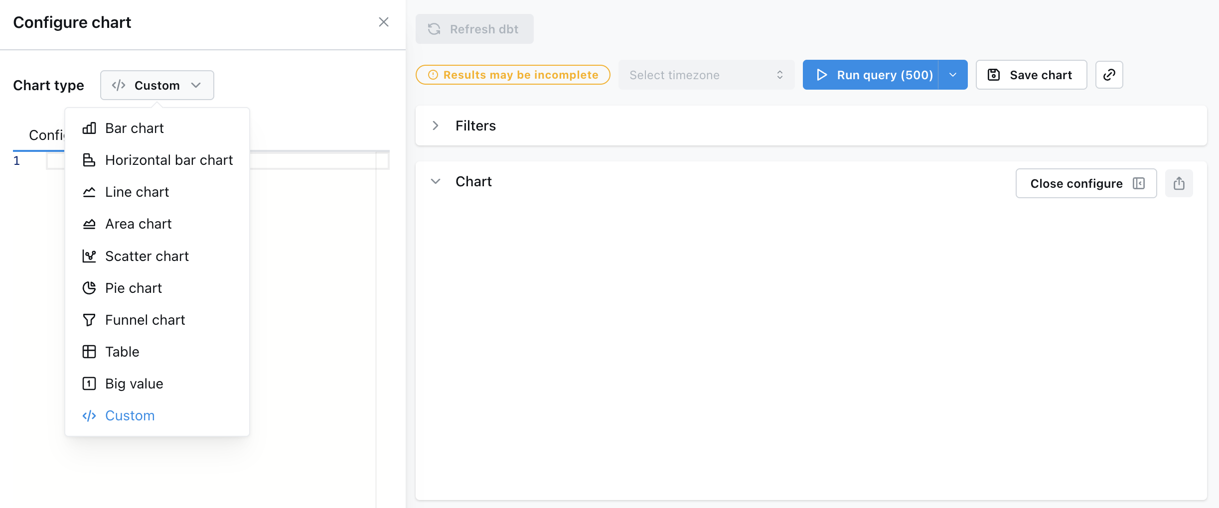
Select a template to load a sample configuration for the chart selected, or grab an example.
**Tip:** LLMs are great at updating Vega Lite configs
Below are some example chart config templates that we got working in Lightdash, along with some tips on when to use each chart type.
## Vega templates
### Bar chart
You can already do this with presets in Lightdash, but it's a simple example you should be able to get working quickly. This chart works best with simple string or date dimensions and a numeric metric
```json
{
"$schema": "https://vega.github.io/schema/vega-lite/v5.json",
"mark": "bar",
"encoding": {
"x": {
"field": "orders_order_date_week",
"type": "temporal" // use quantitative if dimension if string or number
},
"y": {
"field": "orders_total_order_amount",
"type": "quantitative"
},
"color": { // Optional property to pivot the data
"field": "orders_status",
"type": "nominal"
},
"tooltip": [ // Optional property to show tooltips
{"field": "orders_order_date_week", "type": "temporal", "title": "Order Date Week"},
{"field": "orders_total_order_amount", "type": "quantitative", "title": "Total Order Amount"},
{"field": "orders_status", "type": "nominal", "title": "Status"}
]
}
}
```
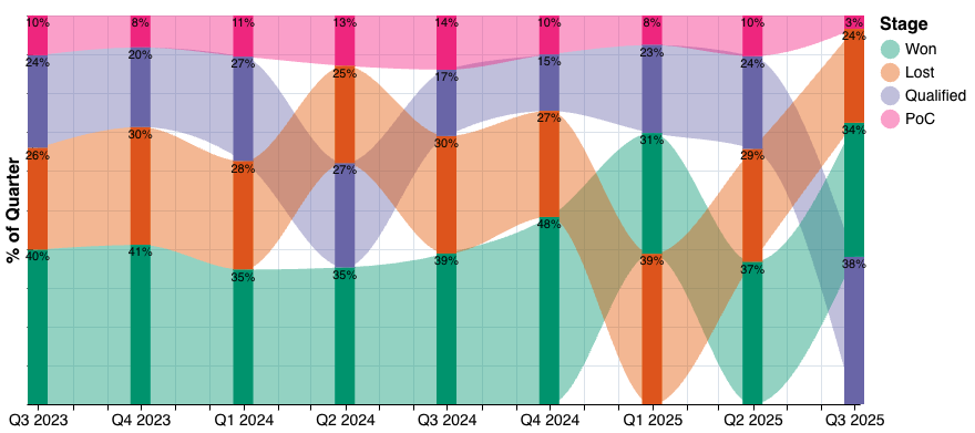
#### Sankey-style bar chart
Use this chart when you want to show how parts of a whole change across categories or time and you want to visualize how individual segments flow from one stage to the next.
It's perfect for things like user cohorts, funnel stages, or survey responses over time. Any scenario where it's helpful to track how groups move or shift between steps.
```json
{
"$schema": "https://vega.github.io/schema/vega-lite/v5.json",
"config": {
"axis": {
"titleFontSize": 16,
"labelFontSize": 14,
"grid": false
}
},
"layer": [
{
"mark": {
"type": "area",
"interpolate": "monotone"
},
"encoding": {
"opacity": {
"value": 0.4
},
"x": {
"field": "deals_created_date_quarter",
"type": "temporal",
"title": null,
"axis": {
"labelExpr": "month(datum.value) == 0 || month(datum.value) == 3 || month(datum.value) == 6 || month(datum.value) == 9 ? 'Q' + (quarter(datum.value)) + ' ' + year(datum.value) : ''",
"grid": false
}
},
"y": {
"aggregate": "sum",
"field": "_of_quarter",
"type": "quantitative",
"stack": "zero",
"title": "% of Quarter",
"axis": {
"labels": false,
"titleFontSize": 16,
"grid": false
}
},
"color": {
"field": "deals_stage",
"type": "nominal",
"title": "Stage",
"sort": {
"op": "sum",
"field": "_of_quarter",
"order": "descending"
},
"scale": {
"scheme": "dark2"
}
},
"detail": {
"field": "deals_stage",
"type": "nominal"
},
"tooltip": [
{
"field": "deals_created_date_quarter",
"type": "temporal",
"title": "Quarter"
},
{
"field": "deals_stage",
"type": "nominal",
"title": "Stage"
},
{
"aggregate": "sum",
"field": "_of_quarter",
"type": "quantitative",
"title": "% of Quarter",
"format": ".0%"
}
],
"order": {
"aggregate": "sum",
"field": "_of_quarter",
"sort": "descending"
}
}
},
{
"mark": {
"type": "bar",
"width": {
"band": 1
}
},
"encoding": {
"x": {
"field": "deals_created_date_quarter",
"type": "temporal",
"axis": {
"labelExpr": "month(datum.value) == 0 || month(datum.value) == 3 || month(datum.value) == 6 || month(datum.value) == 9 ? 'Q' + (quarter(datum.value)) + ' ' + year(datum.value) : ''",
"grid": false
}
},
"y": {
"aggregate": "sum",
"field": "_of_quarter",
"type": "quantitative",
"stack": "zero",
"title": "% of Quarter",
"axis": {
"grid": false
}
},
"color": {
"field": "deals_stage",
"type": "nominal",
"title": "Stage",
"sort": {
"op": "sum",
"field": "_of_quarter",
"order": "descending"
},
"legend": {
"titleFontSize": 16,
"labelFontSize": 14,
"symbolSize": 300,
"orient": "right",
"direction": "vertical"
},
"scale": {
"scheme": "dark2"
}
},
"order": {
"aggregate": "sum",
"field": "_of_quarter",
"sort": "descending"
},
"tooltip": [
{
"field": "deals_created_date_quarter",
"type": "temporal",
"title": "Quarter"
},
{
"field": "deals_stage",
"type": "nominal",
"title": "Stage"
},
{
"aggregate": "sum",
"field": "_of_quarter",
"type": "quantitative",
"title": "% of Quarter",
"format": ".0%"
}
]
}
},
{
"mark": {
"type": "text",
"align": "center",
"baseline": "line-top",
"dx": 0
},
"encoding": {
"x": {
"field": "deals_created_date_quarter",
"type": "temporal"
},
"y": {
"aggregate": "sum",
"field": "_of_quarter",
"type": "quantitative",
"stack": "center"
},
"detail": {
"field": "deals_stage",
"type": "nominal"
},
"text": {
"aggregate": "sum",
"field": "_of_quarter",
"type": "quantitative",
"format": ".0%",
"title": "% of Quarter"
},
"order": {
"aggregate": "sum",
"field": "_of_quarter",
"sort": "descending"
}
}
},
{
"mark": {
"type": "text",
"align": "center",
"baseline": "middle"
},
"encoding": {
"x": {
"field": "deals_created_date_quarter",
"type": "temporal"
},
"y": {
"value": 1
}
}
}
]
}
```
### Heatmaps
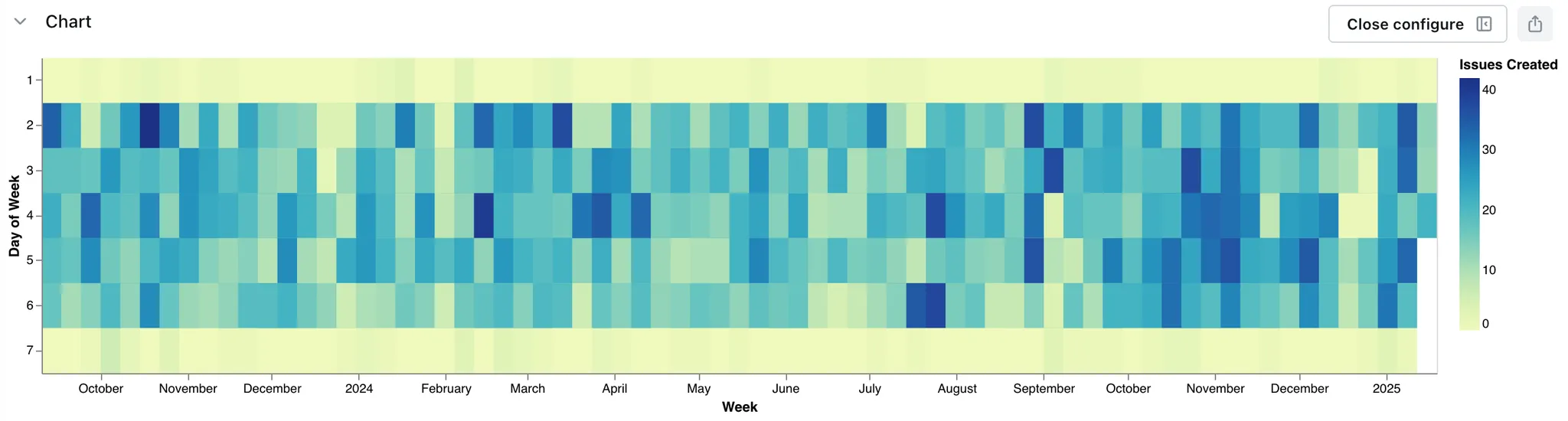
This chart works best with string or date dimensions and a numeric metric as color.
The config below will output a heatmap with the standard Vega-Lite settings that looks like this:
```json
{
"$schema": "https://vega.github.io/schema/vega-lite/v5.json",
"mark": "rect",
"encoding": {
"x": {
"field": "orders_order_date_week",
"type": "temporal"
},
"y": {
"field": "orders_status",
"type": "nominal"
},
"color": {
"field": "orders_total_order_amount",
"type": "quantitative",
"aggregate": "sum",
"scale": {
"scheme": "reds"
}
},
"tooltip": [
{
"field": "orders_total_order_amount",
"type": "quantitative",
"aggregate": "sum"
}
]
}
}
```
### Bubble Plots
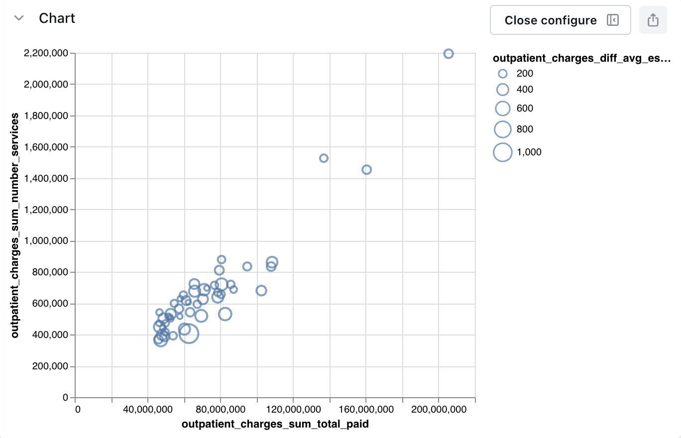
Bubble plots build on top of standard scatter plot visualizations, by allowing you to adjust the size of a given point based on the output of a field. Here's one looking at some Healthcare data.
This chart works best with string or date dimensions and a numeric metric for the y-axis and another numeric metric for the size.
The config below will output a bubble plot with the standard Vega-Lite settings, like this:
```json
{
"$schema": "https://vega.github.io/schema/vega-lite/v5.json",
"mark": "point",
"encoding": {
"x": {
"field": "orders_order_date_week",
"type": "temporal"
},
"y": {
"field": "orders_total_order_amount",
"type": "quantitative"
},
"size": {
"field": "customers_unique_customer_count",
"type": "quantitative"
}
}
}
```
### Funnel charts
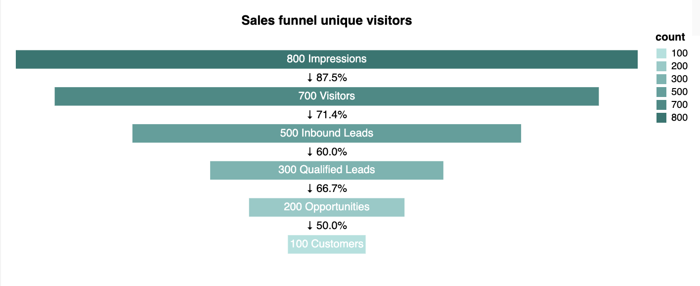
Funnel charts are ideal for visualizing a flow or process where the quantity decreases step-by-step, such as sales pipelines, conversion rates, or order processes. Each stage is represented as a bar whose width reflects the corresponding value.
This chart works best when you have a **categorical dimension** (like a status or step name) and a **numeric metric** (such as order amount or count) to measure at each step.
This chart works best with a string dimension (like status or step name) and a numeric metric (such as order amount or count) to measure at each step.
**TIP:** If you add extra dimensions, the funnel chart will not render correctly.
This is just a sample of the template. Funnel chart configurations are a bit more complex than other charts, so we recommend loading the template directly in Lightdash instead of copying this code manually. The template will automatically map your data fields into the configuration.
The config below will output a funnel chart with the standard Vega-Lite settings that looks like this:
```json
{
"$schema": "https://vega.github.io/schema/vega-lite/v5.json",
"config": {
"view": {
"strokeWidth": 0
}
},
"transform": [
{
"calculate": "datum.orders_total_order_amount + ' ' + datum.orders_status",
"as": "label"
},
{
"window": [
{
"op": "lag",
"field": "orders_total_order_amount",
"as": "previous_value"
}
],
"frame": [
1,
0
]
},
{
"calculate": "datum.previous_value ? (datum.orders_total_order_amount / datum.previous_value) * 100 : null",
"as": "percent_of_previous"
},
{
"calculate": "isValid(datum.percent_of_previous) ? '↓ ' + format(datum.percent_of_previous, '.1f') + '%' : 'N/A'",
"as": "change_label"
}
],
"layer": [
{
"mark": {
"type": "bar",
"color": "#40817c"
},
"encoding": {
"x": {
"field": "orders_total_order_amount",
"type": "quantitative",
"stack": "center",
"axis": null
},
"y": {
"field": "orders_status",
"type": "nominal",
"axis": null,
"sort": null,
"scale": {
"padding": 0.5
}
},
"color": {
"field": "orders_status",
"scale": {
"range": [
"#bde4e2",
"#a2d0ce",
"#87bcb9",
"#6ea8a5",
"#569490",
"#40817c"
]
}
}
}
},
{
"mark": {
"type": "text",
"color": "white"
},
"encoding": {
"y": {
"field": "orders_status",
"type": "nominal",
"axis": null,
"sort": null
},
"text": {
"field": "label"
}
}
},
{
"mark": {
"type": "text",
"color": "black"
},
"encoding": {
"y": {
"field": "orders_status",
"type": "nominal",
"axis": null,
"sort": null
},
"yOffset": {
"value": -9
},
"text": {
"condition": {
"test": "datum.change_label !== 'N/A'",
"field": "change_label"
},
"value": ""
}
}
}
]
}
```
### Waterfall charts
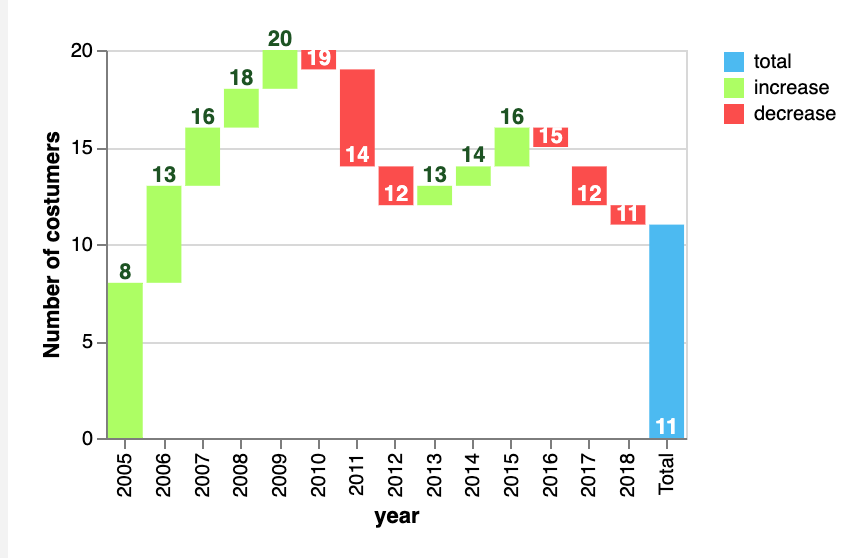
Waterfall charts are used to show how an initial value is affected by a series of positive and negative changes over time or across different categories. They are perfect for visualizing how different factors contribute to a total, like revenue changes, customer growth, or budget breakdowns.
Each bar represents a step: increases are shown in one color (e.g. green), decreases in another (e.g. red), and the final total in a third (e.g. blue).
* This chart works best with string or date dimensions for the x-axis (like a year or stage) and two numeric metrics for the y-axis: one representing the starting point and the other representing the ending point. The difference between these two values defines the height and direction (increase or decrease) of each bar.
* Additionally, you could use a string dimension to color the bars.
The config below will output a waterfall chart with the standard Vega-Lite settings, like this:
```json
{
"$schema": "https://vega.github.io/schema/vega-lite/v2.json",
"encoding": {
"x": {
"field": "orders_status",
"type": "ordinal"
},
"y": {
"field": "orders_total_order_amount",
"type": "quantitative",
"axis": {
"title": "orders_total_order_amount"
}
},
"y2": {
"field": "customers_unique_customer_count",
"type": "quantitative"
}
},
"layer": [
{
"mark": "bar",
"encoding": {
"color": {
"type": "ordinal",
"_comment": "chose a field to color by",
"_field": "type",
"scale": {
"domain": [
"total",
"increase",
"decrease"
],
"range": [
"#4FC3F7",
"#B2FF59",
"#FF5252"
]
}
}
}
},
{
"mark": "text",
"encoding": {
"y": {
"field": "orders_total_order_amount",
"type": "quantitative"
},
"text": {
"field": "orders_total_order_amount",
"type": "nominal"
},
"color": {
"value": "#1B5E20"
}
}
}
]
}
```
### Map charts
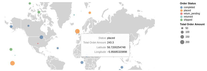
Map charts are perfect for visualizing data that has geographic coordinates, such as customer locations, sales regions, or shipment routes. They combine a background map (usually countries, states, or regions) with your data points overlaid as markers.
This chart works best when you have **latitude and longitude fields** or a TopoJSON lookup with some ID or unique lookup name to plot the points on the map, and a numeric metric to adjust the size of each point or color gradient (like total sales or number of customers).
#### World map country bubbles
In this example, the base world map is drawn using a TopoJSON file of countries, and data points are plotted as circles, with their size based on the total order amount.
The config below will output a map chart with the standard Vega-Lite settings, like this:
```json
{
"projection": {
"type": "mercator",
"scale": 100, // Change scale to zoom into the map
"center": [
10,
50
]
},
"layer": [
{
"data": {
"url": "/vega-world-map.json", // Lightdash default world map
"format": {
"type": "topojson",
"feature": "countries"
}
},
"mark": {
"fill": "lightgray",
"type": "geoshape",
"stroke": "white"
}
},
{
"mark": "circle",
"encoding": {
"size": {
"type": "quantitative",
"field": "orders_total_order_amount",
"legend": {
"title": "Total Order Amount"
}
},
"color": {
"field": "orders_status",
"type": "nominal",
"legend": {
"title": "Order Status"
}
},
"tooltip": [
{
"type": "ordinal",
"field": "orders_status",
"title": "Status"
},
{
"type": "quantitative",
"field": "orders_total_order_amount",
"title": "Total Order Amount"
}
],
"latitude": {
"type": "quantitative",
"field": "latitude"
},
"longitude": {
"type": "quantitative",
"field": "longitude"
}
}
}
]
}
```
#### USA counties choropleth
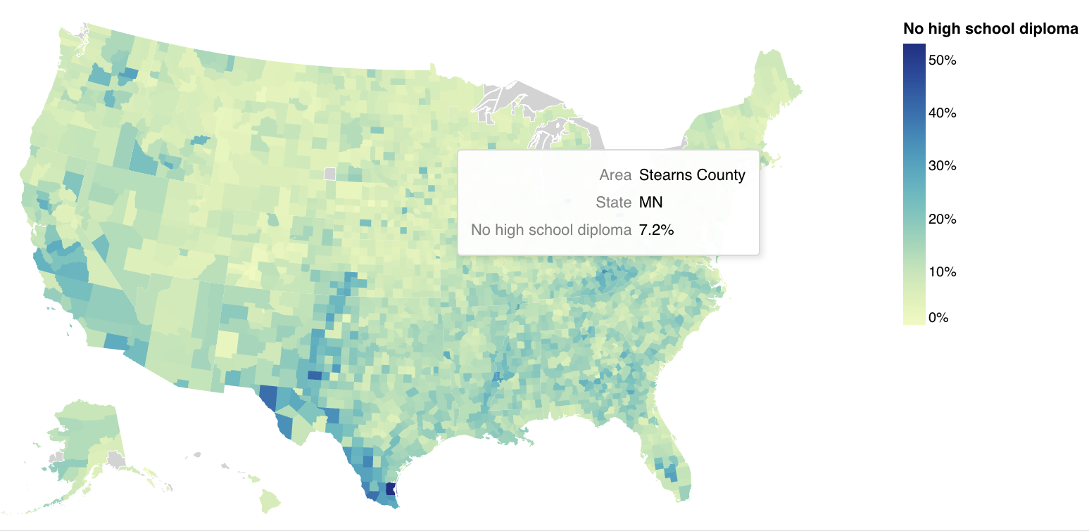
To load additional maps, you can specify a full URL on the data layer, and adjust the projection if needed, for example, below is the code for a county-level map of the United States.
The config below will output a map chart like this:
```json
{
"layer": [
{
"data": {
"url": "https://vega.github.io/vega-lite/data/us-10m.json",
"format": {
"type": "topojson",
"feature": "counties"
}
},
"mark": {
"fill": "lightgray",
"type": "geoshape",
"stroke": "white"
}
},
{
"mark": {
"type": "geoshape"
},
"encoding": {
"color": {
"type": "quantitative",
"field": "no_h_s_diploma_1",
"format": ".0%",
"legend": {
"title": "No high school diploma",
"format": ".0%"
}
},
"shape": {
"type": "geojson",
"field": "geometry"
},
"tooltip": [
{
"type": "nominal",
"field": "education_by_county_area",
"title": "Area"
},
{
"type": "nominal",
"field": "education_by_county_state",
"title": "State"
},
{
"type": "quantitative",
"field": "no_h_s_diploma_1",
"title": "No high school diploma",
"format": ".1%"
}
]
},
"transform": [
{
"as": [
"county_id",
"geometry"
],
"from": {
"key": "id",
"data": {
"url": "https://vega.github.io/vega-lite/data/us-10m.json",
"format": {
"type": "topojson",
"feature": "counties"
}
},
"fields": [
"id",
"geometry"
]
},
"lookup": "education_by_county_fips_code"
}
]
}
],
"projection": {
"type": "albersUsa"
}
}
```
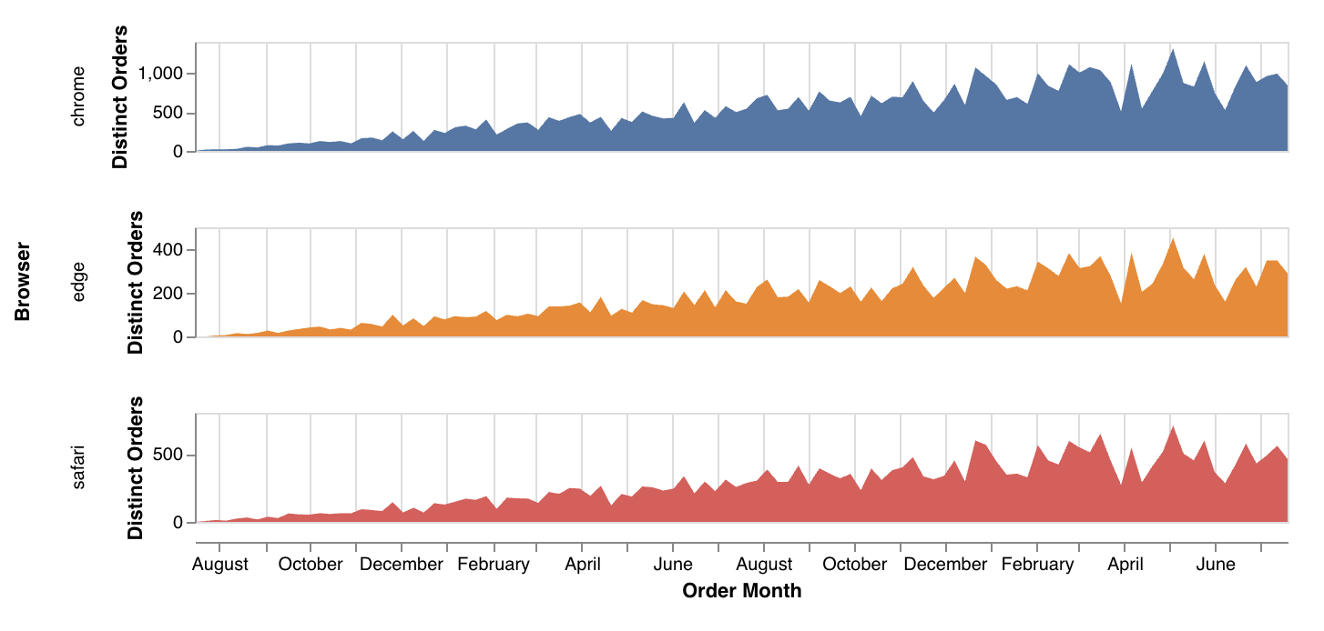
### Trellis area chart
Trellis Area charts (also called small multiples or faceted area charts) are used to compare trends across multiple categories over time, with each category shown in its own mini chart. They're perfect for spotting patterns, outliers, or seasonality within individual segments, like: product lines, user groups, or marketing channels, without crowding everything into a single chart.
Trellis Area charts are especially helpful when you want to emphasize the shape of trends rather than exact values.
The code below will give you a trellis area chart like this:
```
{
"$schema": "https://vega.github.io/schema/vega-lite/v6.json",
"description": "Distinct order counts by browser and month.",
"facet": {
"row": {
"field": "dbt_orders_browser",
"type": "nominal",
"title": "Browser"
}
},
"spec": {
"width": 600,
"height": 60,
"mark": "area",
"encoding": {
"x": {
"field": "dbt_orders_order_date_week",
"type": "temporal",
"title": "Order Month",
"axis": {
"grid": true
}
},
"y": {
"field": "dbt_orders_count_distinct_order_id",
"type": "quantitative",
"title": "Distinct Orders",
"axis": {
"grid": false
}
},
"color": {
"field": "dbt_orders_browser",
"type": "nominal",
"legend": null
},
"tooltip": [
{
"field": "dbt_orders_browser",
"type": "nominal",
"title": "Browser"
},
{
"field": "dbt_orders_order_date_week",
"type": "temporal",
"title": "Order Month"
},
{
"field": "dbt_orders_count_distinct_order_id",
"type": "quantitative",
"title": "Distinct Orders"
}
]
}
},
"resolve": {
"scale": {
"y": "independent"
}
}
}
```
### More examples
You can find more examples on the [Vega lite official website](https://vega.github.io/vega-lite/examples/).